Hey Homies! I’ve been busy in the master bathroom this week. As usual, I was just minding my own business when an idea popped into my head. It all started when the fantabulous Designer, David Bromstad sent me this wonderful print "Daydream" (hanging above). I was so excited to win it in at one of his recent Twitter parties, for the Before/After photos I submitted for this
Tween Spy Room remodel!!! So, when I finally received the print, I giddily wandered around the house trying to find just the right spot to hang it - which WAS a challenge by the way because the walls around here seem to be full! There are a few empty spots in the basement, but the kids spend more time down there than I do and I wanted my “Daydream” to hang some place where I could enjoy it often. This is MY "Daydream"! Then it hit me!
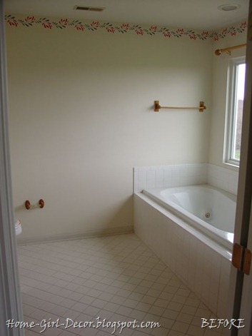
I guess I should back up to the before picture. Four years ago, we started with this……..

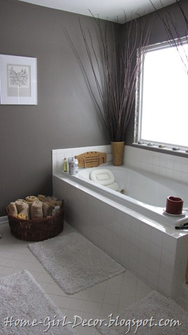
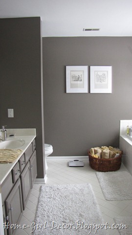
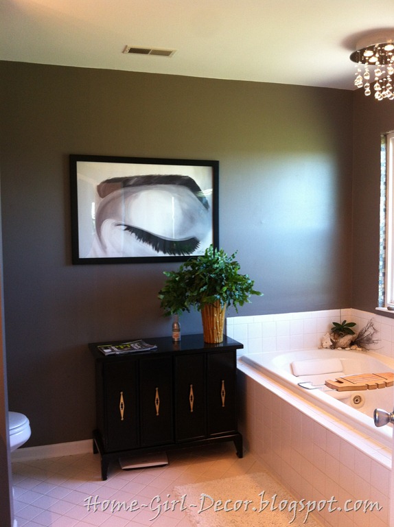
I initially removed all of the wooden wall fixtures, painted the dingy ceiling bright white, and painted the walls AND oak vanity a dark gray color, the same gray color found in other parts of the house and in the fabric used in the adjoining master bedroom.

Paint alone really gave this room a nice updated feel. But I’ve always wanted to add some drama to the back wall of the master bathroom………some color, pattern, stripes, colorful art …………something.
I do love the gray walls, but the artwork that I chose to hang in the bathroom was definitely lacking in color. I did bring color into the room with towels, candles, etc., but this wall needed more color. The attached master bedroom has a feature wall with a series of gold, white, silver, black and tan stripes which I was considering repeating behind the artwork in the master bathroom to bring some color to the wall and to also highlight the art. But I first wanted to figure out the towel storage cabinet solution before spending too much time on adding color to the wall. At least the plain gray paint was clean, updated and modern – a fresh, clean slate.

But…..… this bathroom has been in this fresh clean slate for the last four years so now it's old again! We’ve been trying to decide if we should do (a) a BIG remodel to expand the bathroom to include the adjacent sitting room which would change the entire layout of the bathroom, or (b) a MEDIUM remodel which would include a new double vanity, tile floor, tile shower, and a new tub, but keeping the existing layout, or (c) just a SMALL remodel which would basically include paint, new plumbing and lighting fixtures, and maybe a new vanity. I think we can be happy with the third option for a while, keeping the white tile, changing out the fixtures and eventually getting a new vanity.
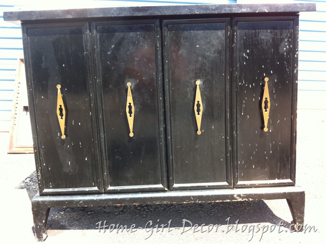
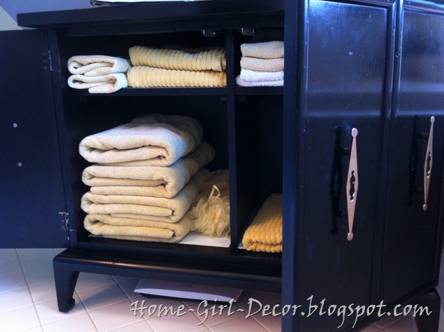
So when it hit me, when I thought the David Bromstad print would be just the thing to take this room up a notch, to compliment the print I also thought of a special piece of furniture that I accidently stumbled upon, and fell in love with, recently. I found this beauty in someone’s garage a few weeks back. I went there to buy ONE little antique marble top plant stand table for $15, and left with my mini-van packed full of treasures for $75! This cabinet is HEAVY solid wood and the gentleman I bought it from said it belonged to his mother for a long time. I love how the lines of the legs on the side sort of jut out….sort of like my hips. hehe The paint was a little chipped up around the legs, but most of the spots on the door were from something being splattered on it that was easily wiped off. But what I REALLY fell in love with was that HARDWARE! I’m a sucker for cool vintage hardware, FOR SURE!

I didn’t like the fact that I put this cabinet in storage and was in the process of trying to figure out how to “coolify” it and resell it. Then, I decided I didn’t really want to “coolify” it because it was already so cool to me and I wanted to take it out of storage and bring it home with me. But just like every cute little puppy that doesn’t have a home, I can’t bring them all home with me and put them in my house…..unless I find the perfect use and perfect spot for them, right? So, BAM! I would hang my beloved David Bromstad print, above my beloved vintage newly-designated towel cabinet (that I would now get to keep and not have to resell),which would now sit beside my beloved bathtub, which is under my beloved bubble light fixture. Oh yeah, the bubble light fixture! I almost forgot!
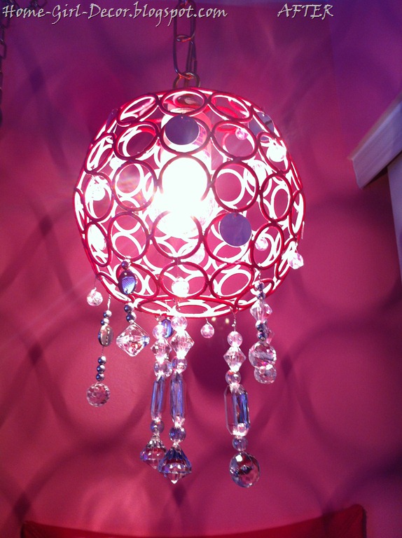
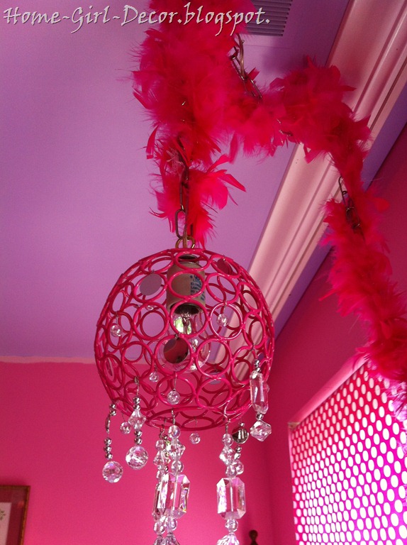
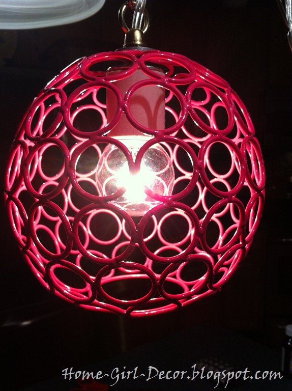
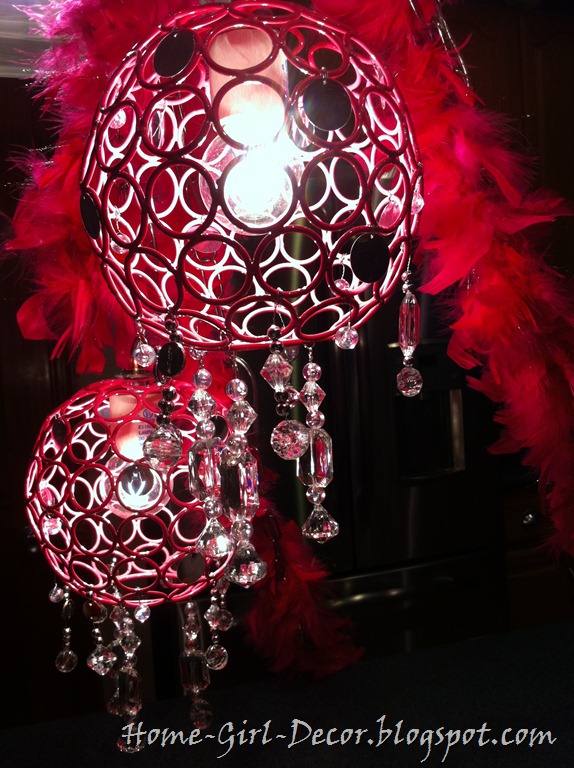
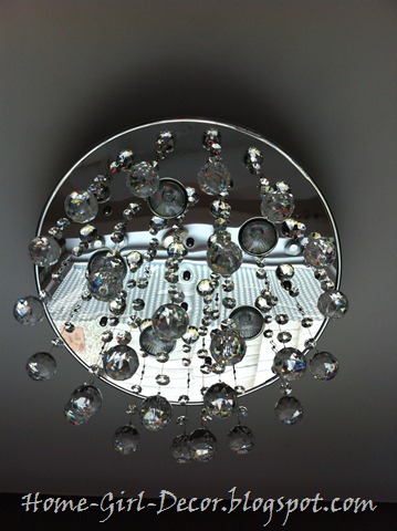
This was a Valentine’s gift from my sweet husband earlier this year. I hated staring up at the ugly can light over our tub when I was bathing and always dreamed of a pretty little chandelier hanging there one day. When I saw this cute and reasonably priced fixture on Overstock.com
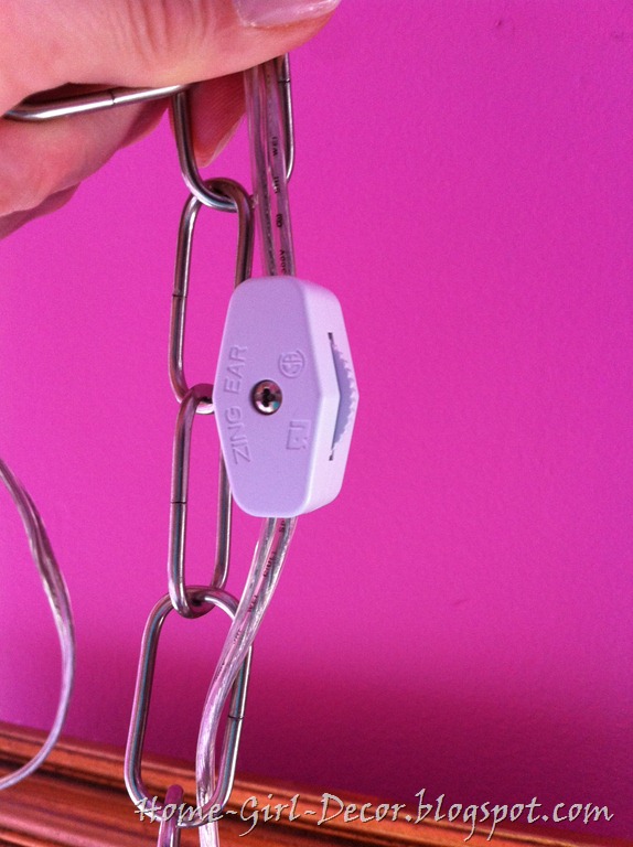
Bubble Chandelier, I just thought it would be very beautiful and playful hanging over our tub. It immediately jumped on to the wish list around the same time my husband just happened to be looking for a gift to buy for me. Funny how that happens sometimes, huh? (**evil laugh**) It IS much nicer to look at than that old can light, indeed! AND he even installed it on a dimmer so it makes a beautiful night light as well. Oh yes, he is good.

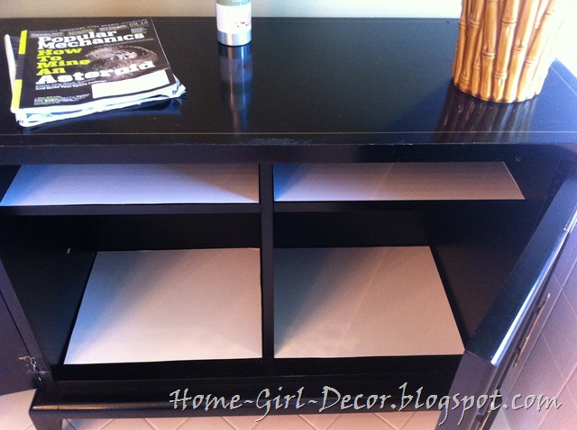
Instead of refinishing my new old towel cabinet for the next week or two, I cleaned the cabinet inside and out, polished the brass hardware, used a black paint pen to touch up the chipped legs, shined the entire cabinet with a finishing paste wax, and lined the shelves with contact paper.

And it was good as new! Almost! Actually, it’s still a little bit beat up and scratched. But just by covering the scraped legs with black touch-up paint, and by waxing the entire piece, it was transformed into a much nicer looking piece…..without refinishing. I actually prefer this piece with a few dents and dings. Then I don’t have to be so careful about not messing up the new paint job, which would probably be the case if I refinished it. I ended up becoming so fond of this piece that it has steered me into a “mismatched”or “not-so-matchy-matchy” direction for the vanity/sinks when that day comes. But for now, the good news is that the towel basket is finally gone, and that we have a new, cool, vintage, real grown-up piece of furniture for towel storage.

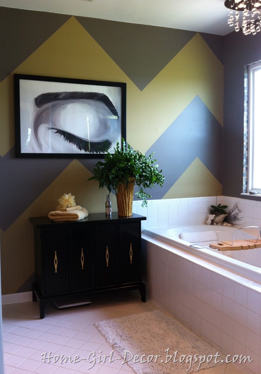
So after committing to utilizing this cool vintage low storage piece for towels instead of using a tall cabinet that coordinated with a double sink vanity cabinet, I decided to hang my new artwork (which was also lacking color by the way so the wall would still need more color) over it as sort of an inspiration for me to work on myself more. I have a tenancy sometimes to care more about what a wall looks like than what I look like, and I actually have to remind myself to wear a little mascara and blow dry my hair every once in a while. So this beautiful print will now serve as my inspiration to glam it up more often.

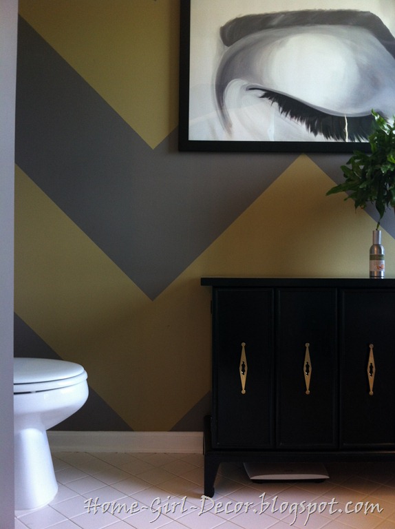
This is certainly a big improvement over the old look, but, just as before, it was STILL a little boring looking to me. Since the towel storage situation was finally sorted out, I was okay with finally spending the time to paint the wall with a fun design and a little more color. Chevron patterns are really big in design lately, and I’ve been wanting to paint a chevron wall so bad, so I decided to add a little zigzag funk to all these pieces of collected love I used in this room……....the bubble chandelier, the David Bromstad “Daydream” print, and that awesome vintage cabinet. Painting a harlequin pattern on the wall was another idea I had because of the shape of the handles on the retro cabinet, but that seemed a little more feminine than what I had in mind. I’ve really been trying to keep my husband in mind more when designing our spaces because I tend to think too girly sometimes if I’m not concentrating on him. So, the chevron pattern seemed a lot more masculine to me, like Charlie Brown's shirt. hehe
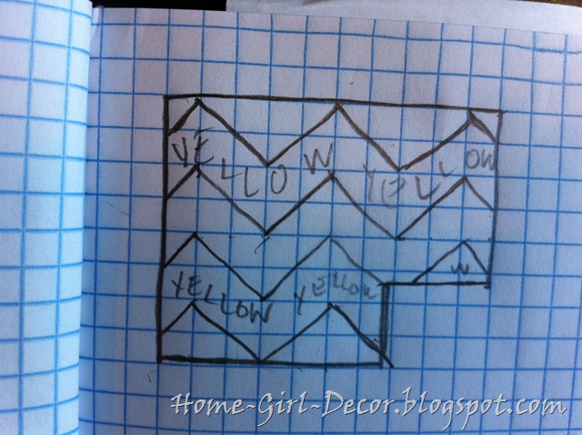
When painting a design onto a wall, I always start with a sketch to get the scale in perspective. I don’t have any fancy software that does this for me, but I always just sketch on simple graph paper using one box equals one foot as a scale. Here’s my simple sketch for the chevron pattern bathroom wall.

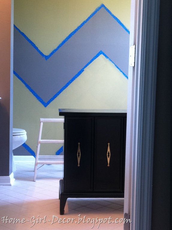
When painting a pattern, I do find it important to sketch it out and also to make a notation of the part that will be painted - in this case the “yellow” part (above) is the part to be painted. When the design becomes more complicated, it’s helpful to place a piece of tape on the areas that DO NOT get paint.

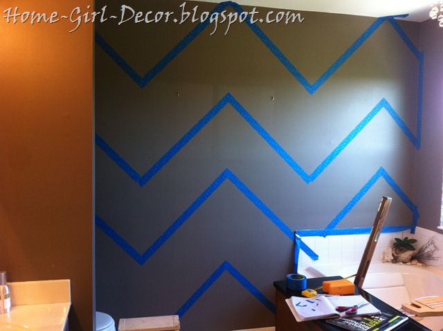
This was an easy pattern to tape out using a measuring tape, a four foot level, and by following the measurements of the sketch.

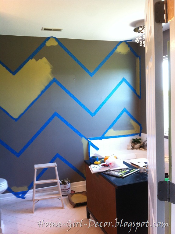
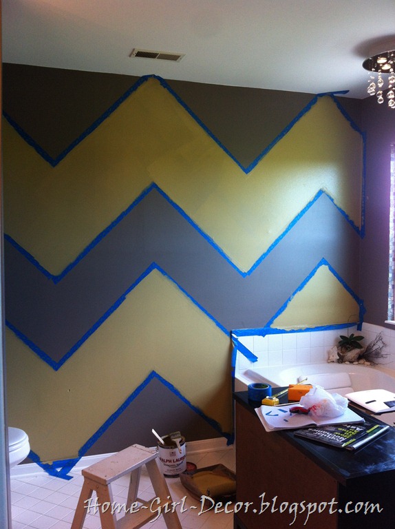
Yellow or gold was the obvious color choice for the zigzags because similar tones were used as an accent color in the master bedroom with yellow wingback chairs flanking the bed, gold vases on the dresser, and the color yellow scattered in the art and fabric. I didn’t use the exact golden yellow paint in the bathroom as was used on the stripes in the master bedroom because I was almost out of that paint, but what I did use was a similar color that I picked up a couple of years ago from the “oops” pile at a home improvement store for literally just a couple of bucks. It is a Ralph Lauren “matte” mis-mixed color that I initially bought to use on the office ceiling. I decided to change the office wall color to gold instead of the ceiling, but I didn’t want to use the “matte” paint on the walls in the office so it has been sitting unused ever since. So the texture of the chevron pattern wall in this master bathroom will be a mixture of both a semi-gloss finish for the gray and a matte finish for the gold zigzags.

Looking nice, huh?

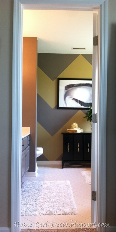
So after four years, that wall finally got it’s color on! YES! Don’t the zigzags go well with that awesome vintage hardware? And I think that the golden yellow color of the zigzag also helps the brass hardware on that cabinet to fit in with the rest of the chrome hardware going into the bathroom.

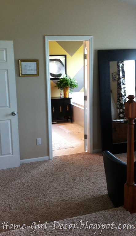
The yellow gold color on the bathroom’s back wall also really warms that room and lures you into the bathroom from the sitting area, a/k/a the “waiting room”, located in the master bedroom, just outside the master bathroom.

The sitting area outside the bathroom is the part of the master bedroom that we were considering renovating and expanding into a new and improved master bathroom. But for now, it’s just a nice place to sit and read, or a comfy place to sit and look out the window into the back yard………………….

……or merely just a nice place to sit and peer at the beautiful new bathroom wall.
This Home Girl LOVES it!
Thanks for stopping by Homies! I hope you like the new look as much as I do!
